Tailwind CSS for beginners
Getting started with Tailwind CSS ...

What is Tailwind CSS ?
As targeting multiple screens became a necessity, we can't imagine designing a website without using any CSS framework like Tailwind CSS, Skeleton, Susy, Bootstrap, Foundation, Bulma, Pure, Materialize etc. Using this frameworks takes away a lot of pain.
Tailwind CSS provides customization, more productivity, code reuse and smaller bundle-size.
Installation
- Install tailwindcss via npm, and create your tailwind.config.js file.
> npm install -D tailwindcss
> npx tailwindcss init
- Add the Play CDN script tag to the of your HTML file, and start using Tailwind’s utility classes to style your content.
<script src="https://cdn.tailwindcss.com"></script>
Utility First Fundamentals
- Tailwind’s flexbox and padding utilities (flex, shrink-0, and p-6) to control the overall card layout
- The max-width and margin utilities (max-w-sm and mx-auto) to constrain the card width and center it horizontally
- The background color, border radius, and box-shadow utilities (bg-white, rounded-xl, and shadow-lg) to style the card’s appearance
- The width and height utilities (w-12 and h-12) to size the logo image
- The space-between utilities (space-x-4) to handle the spacing between the logo and the text
- The font size, text color, and font-weight utilities (text-xl, text-black, font-medium, etc.) to style the card text
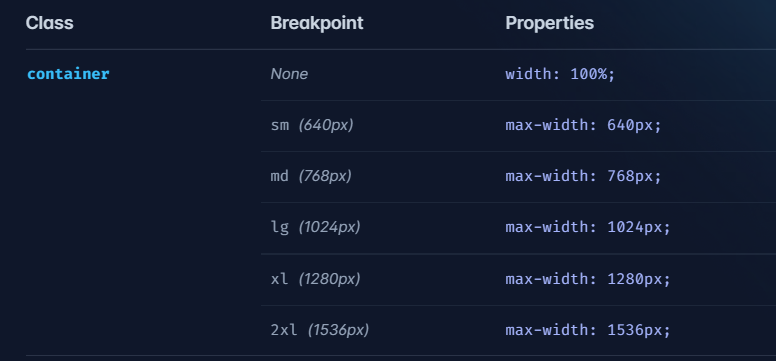
Container
The container class sets the max-width of an element to match the min-width of the current breakpoint. This is useful if you’d prefer to design for a fixed set of screen sizes instead of trying to accommodate a fully fluid viewport.
Hover, background color, margin and padding
<script src="https://cdn.tailwindcss.com"></script>
<div class="btn">
  <button class="bg-gray-400 m-4 ml-5 p-4 hover:bg-violet-600
 hover:text-white hover:rounded-md hover:font-bold">Click here!</button>
</div>
Flex
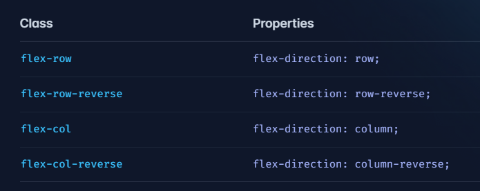
Flex-direction
We have four directions as follows:
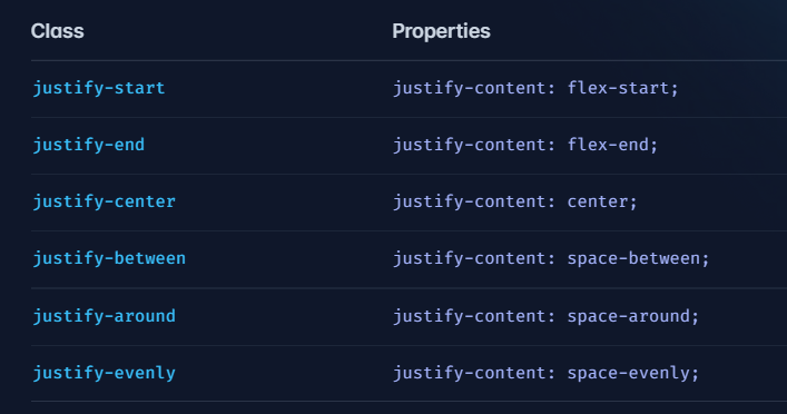
Justify-content
Controls how the flex and grid items are positioned along the main axis (horizontally for website and vertically for mobile).
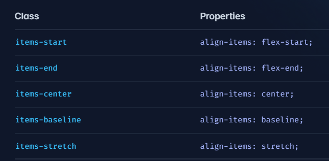
Align-items
Controls how the flex and grid items are positioned along the cross axis (horizontally for mobile and vertically for website).
Typography
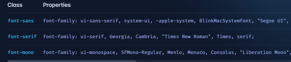
Font style
Controlling the font family of an element.
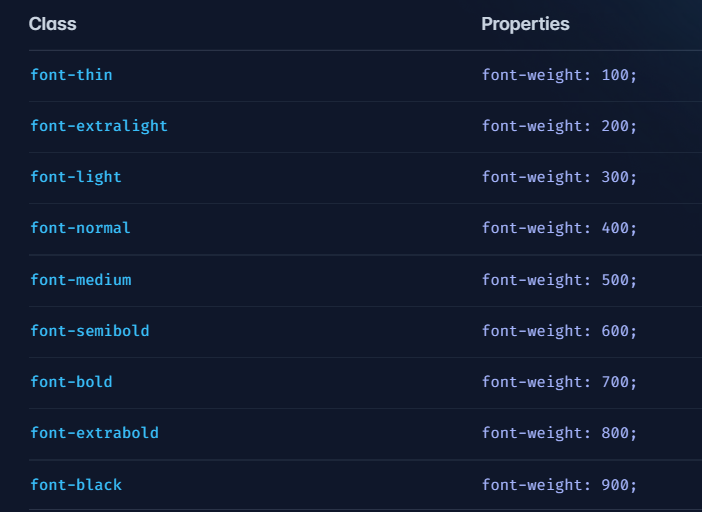
Font weight
Controls the font - weight of elements.
We also have font size, font style, letter spacing, text align, text color, text-decoration and many more.
Conclusion
Hope this article has given you some brief idea about what Tailwind CSS is. Thank you for reading :)


